HealthsOwn


Project Summary
I had the pleasure of creating an android application to help individuals track their mental health and improve their habits, a UX design project for a small startup company.
Role & Duration
In this project, I was involved in every step along the way and worked in a team with another designer. This was a small project focusing on the following parts of the app:
- sign-up flow
- daily check-in
- mood check-in
- healthy habits
This was a small project, with a duration of approximately four days.
The problem
The clients have identified the needs of their users and provided us with a persona, and customer segment. This app was already under development, and my colleague and I were hired to continue the work.
Goals
The goal of the users is to have access to a solution that will make it easier for them to track their mood fluctuations and their healthy habits. They also want an easy and enjoyable way of keeping track of their health, and they want access to guided meditations and suggestions to different forms of exercises they can do to unwind.
The design process
As this was a short project with defined requirements from the client, our normal and full framework of the design thinking process could not be used in its entirety, however, we went through the steps, as it made it easier for us to structure the project and made sure that the solution we were designing would meet the needs of the user and the business.
Empathise
We started with getting an overview of the project and how we might approach it in the best possible way. As the client had done most of the research and insight, and had a clear definition of what kind of app they wanted, we used their research to create the solution. We had some struggles when it came to understanding the needs of the users, and to fully understand what was the deliverables.

Define
We were given a persona that was based on the insight made by our client, and used that information to generate a persona that had a set of clearly defined motivations and pain points. We knew that the user's mood will change and fluctuate during the day, and that this was important to remember when we worked on understanding the brief. We also spent some time doing research and examined other types of health tracking apps that we already had installed, and looked for inspiration at dribble.


Ideate
To be able to prototype quickly, we started creating mood boards to get into the right creative flow, and to start building a visual guide of how we wanted the end product to look alike.

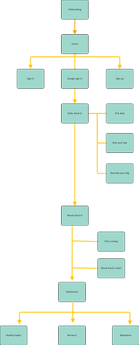
As we already had the requirements for the app, we used this information to start building our Information architecture and the user flows. With limited time we decided to focus on creating user flows for the signup, as we knew that we had to plan for error messages etc in the flow, and to make sure that we created a flow that was easily understood by the users.

We also held a small sketching workshop to get into the right head space and took into consideration of persona and mood boards to create these sketches.


Prototype
This was a fairly quick prototyping process that was built upon our mood board and sketches. We decided to create a small design system to help with the prototyping and design and with a warm colour palette that will encourage the users to relax and unwind. Throughout the process we adhered to best practices and were consistent with the UI, to make sure that we created a design that is easy to navigate for the user. This step proved to be a bit time consuming as we did have some struggles with landing with the overall look and feel of the app and to create elements that were visually engaging and interesting for the users.
Results
In the end we were able to produce mockups for the app, with all the pages that the client had asked for.
In hindsight, there are some things that could have been done differently. We should have given the persona more consideration and been more aware of how the persona affected our design decisions. And even though the color palette is varm ,calming and has enough contrast, it might not be enough to motivate the users to continue with their mood tracking.